Gray Areas

When I was shooting film as a teenager, I shot in color exclusively. That wasn’t because I didn’t want to shoot black and white, it’s because I didn’t even consider it an option. I grew up outside a very small town surrounded by other small towns. I never saw it in stores, and I wasn’t aware of anyplace nearby that sold it. The closest actual camera store was an hour’s drive away. The only camera I really had access to was my mom’s Minolta Maxxum 7000, which usually had Fuji 200 or Kodak Gold in it. After shooting early digital cameras in college and being sufficiently underwhelmed, I briefly returned to film and shot some Portra and Ektar along with the aforementioned Fuji and Kodak stocks. It didn’t take long for me to realize that, as much as I loved film, I didn’t have the cash to keep shooting it. So I saved up for a DSLR and stuck with digital, becoming more and more jaded and disillusioned over the following ten years. It was at this point, while cleaning a closet, that I came across the old Minolta and discovered a half shot roll of Portra 400 VC inside.
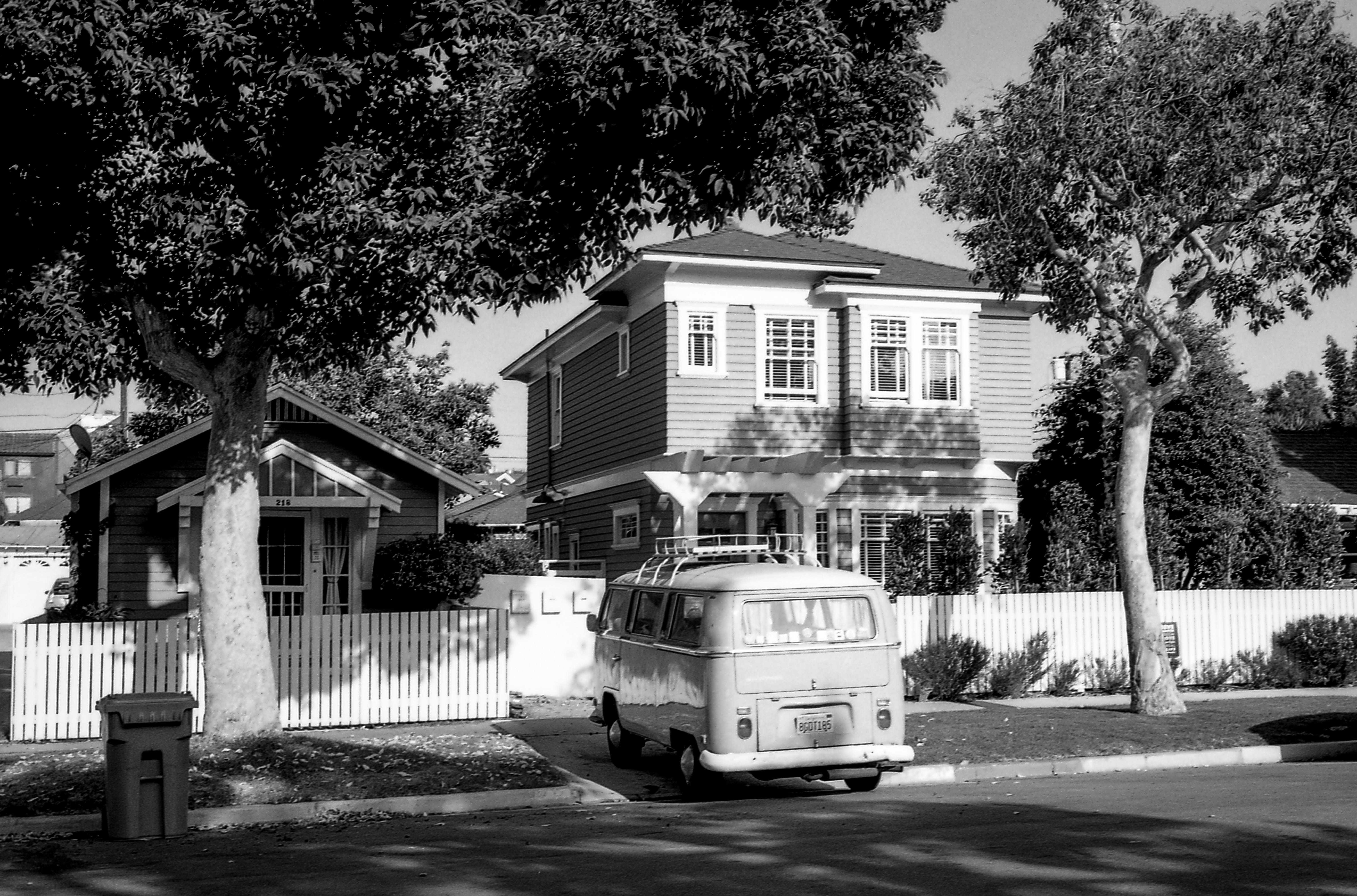
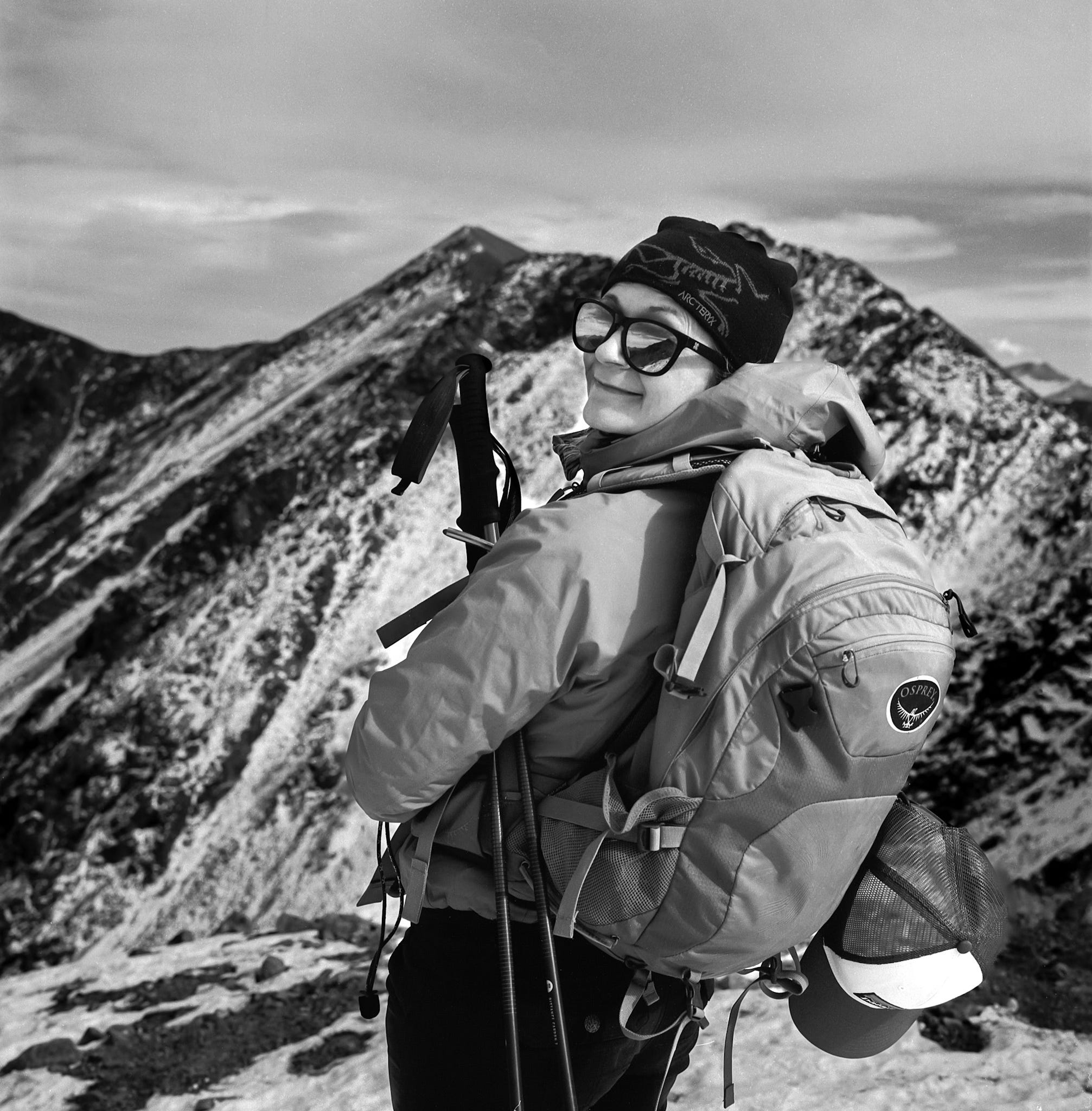
A lot had changed for me over the intervening 10 year period. I moved to Los Angeles, got married, had a great job, and spent my weekends running around in the mountains. I no longer carried the DSLR, instead opting for a Sony RX100 II- a model much more suited to hiking, rock climbing, and trail running. There was certainly no way I was going to take this ancient Minolta to do any of that- but I figured a walk around my neighborhood in Hermosa Beach to finish the roll couldn’t hurt. I knew enough back then to realize that this roll of Portra 400 VC which had been transported across the country in unventilated shipping containers multiple times, then stuffed into a closet for several years was not going to look good exposed at box speed, so I dialed in a couple stops of compensation and took some underwhelming photos of some underwhelming scenes before dropping it off at a local lab, only to collect some underwhelming negatives. I was so sure I’d be underwhelmed, in fact, that I didn’t even bother having them scanned. I put them aside and loaded in a fresh roll of Ektar, and went out to shoot that as well. Then I shot a roll of this new stuff called Cinestill 50D. Before I knew it, I was camera shopping. Over the next few weeks, I bought a Nikon F100, then an Olympus 35SP, and a Nikon FM2n. I was off and running- well, not running, really. More like slowly walking. These cameras were fun, but much more unwieldy than the RX100 I was used to. More importantly, I’d picked up an Epson flatbed scanner and a Patterson tank. I’d always heard that developing color film was difficult (spoiler alert: it’s not) so I figured I should start slow with some B&W film and monobath developer (would not recommend). With that in mind, I went out and shot a roll of newly released Fuji Acros 100 II.
I took a lot of shots on that roll that I didn’t care for much, and just a few frames that were enough to make me want to shoot more B&W. Besides, I had a whole bottle of developer I needed to use. From that moment forward, I always kept a roll of B&W in at least one camera. These days, I find myself shooting B&W over color at a rate of about two rolls to one. All in all, over the past six years, I’ve shot and developed several hundred rolls of B&W film. That doesn’t make me an expert on the stuff by any means- I’m sure many of you reading this have shot and developed far more- but to say that I’ve learned a lot about film, developers, and especially about my own personal tastes during that time would be an understatement. For example, it didn’t take long for me to figure out that I liked the dark skies and brighter skin tones I got with Acros vs other stocks, and I began researching why I got that result more frequently with Acros than I did with stocks like Tri-X or HP5.
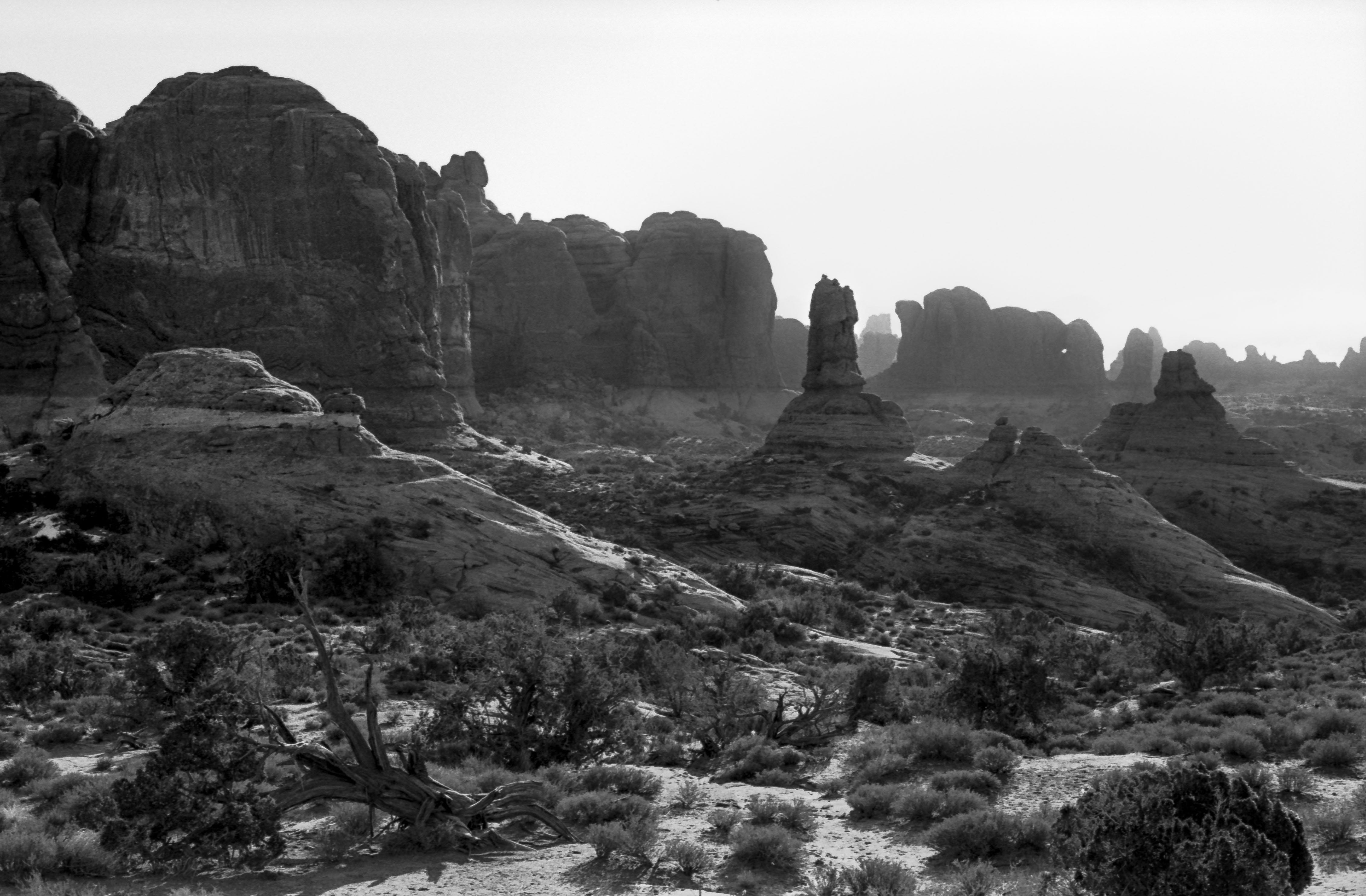
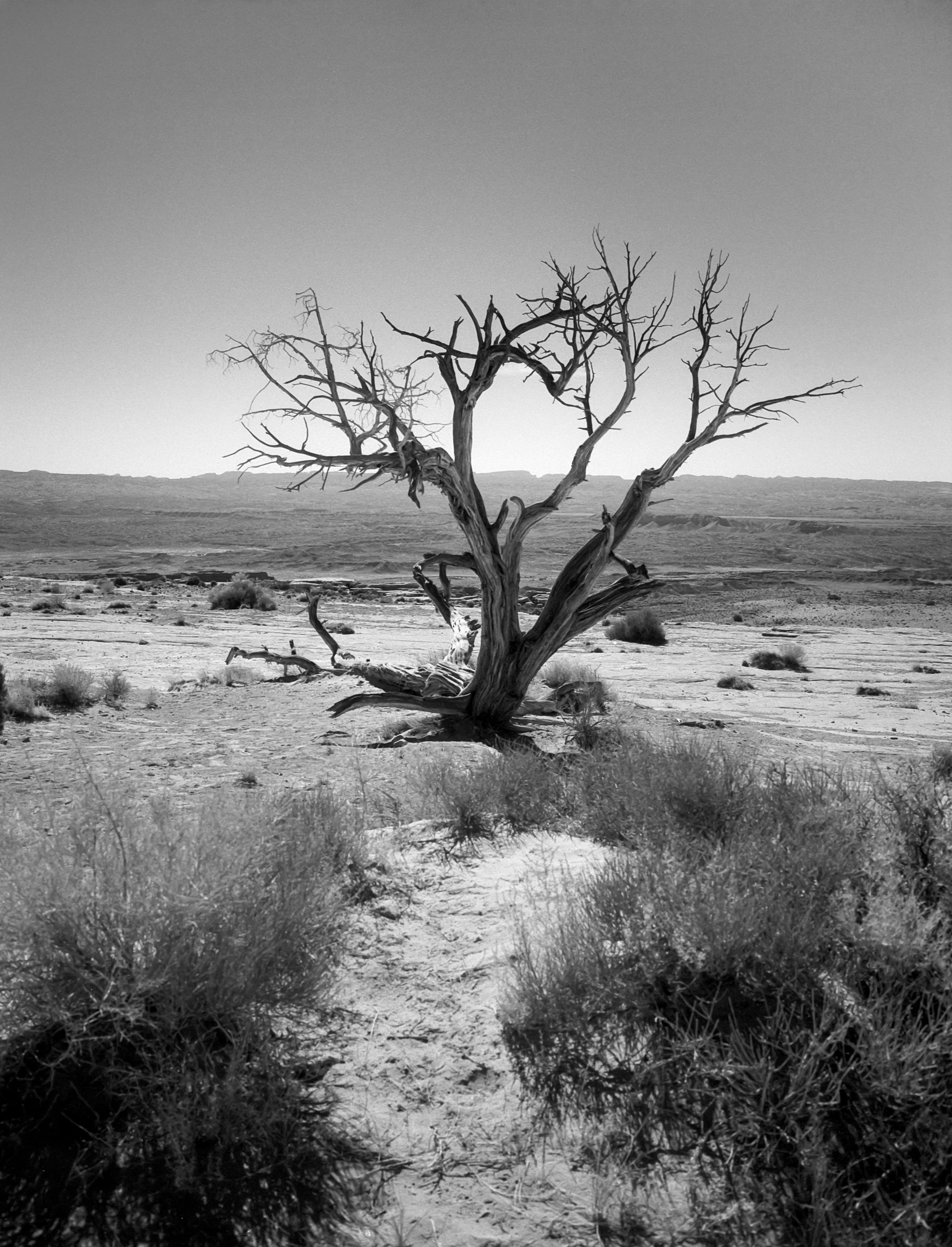
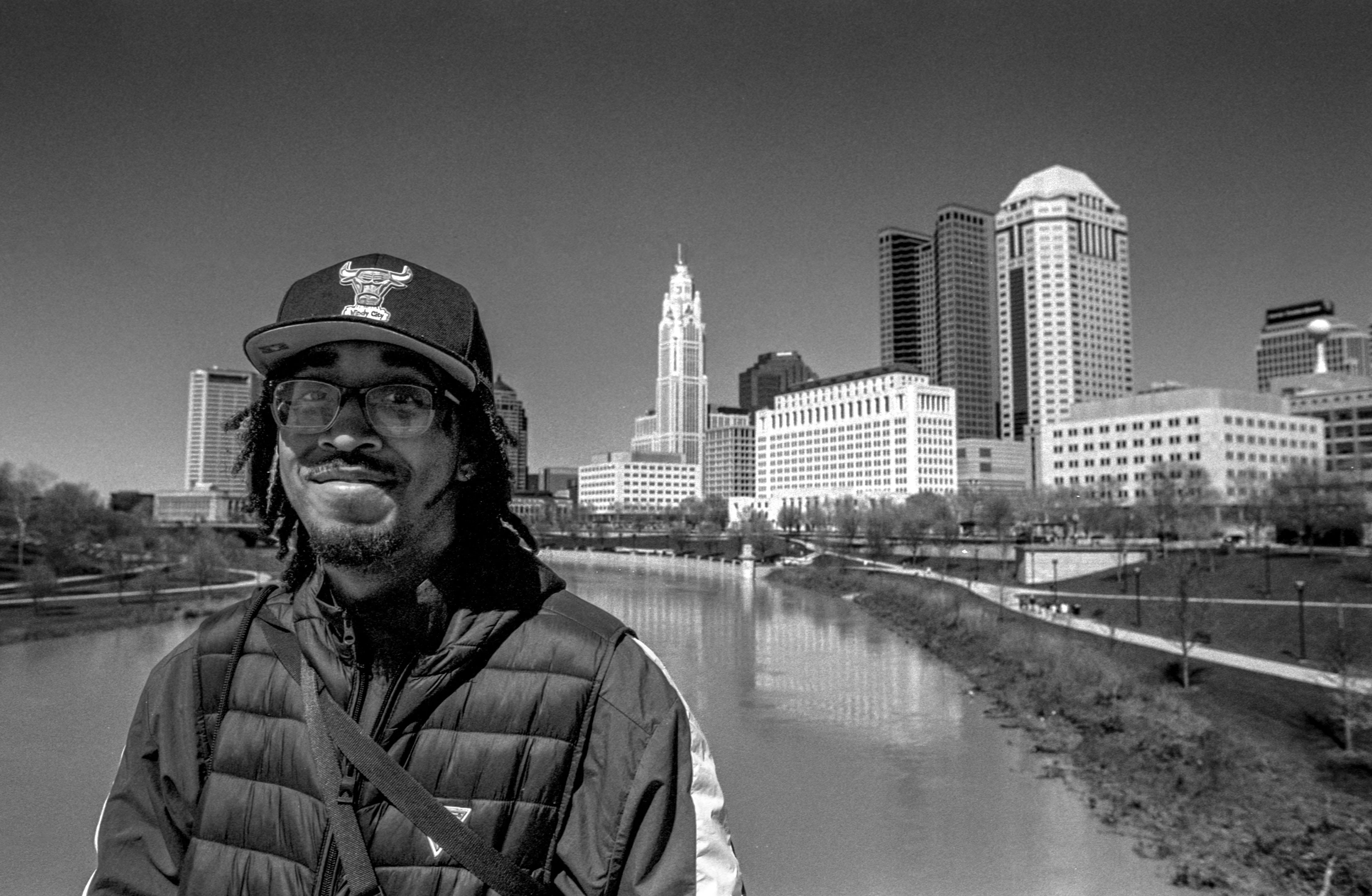
I had previously not considered the idea that a film might be relatively more or less sensitive to certain wavelengths of light, and I became momentarily obsessed with finding out how the stocks I shot compared with each other on this front. One thing that I always liked about doing B&W conversions with digital RAW files was being able to selectively adjust the brightness values based on color. To know that I could choose a film stock based on the look I anticipated wanting to achieve seemed like a more challenging analog equivalent. Invariably, when I did those B&W conversions, I found myself brightening the yellows and oranges that corresponded with skin tones and darkening the blue skies and shadows. It seemed that I had stumbled across my ideal B&W film stock right away, and I began shooting through rolls of it very quickly. As I shot Acros more and more, I started to realize just how specialized it actually is. Because it is significantly less sensitive to blue wavelengths and more sensitive to yellows, oranges and reds, failure to take this into account when metering can lead to results that are either exactly what you want, or exactly what you don’t. I realized that I loved it for environmental portraits, where I want my human subject to dominate the scene, even if they aren’t taking up a majority of the frame. Fluffy clouds in the sky? Shooting Acros is like having an orange filter on your lens without the speed loss. Right about the time that I discovered this enthusiasm for Acros, Adorama had what I still assume was an accidental sale- 5 rolls for $25. I bought it all- or at least what felt like “all.” I assumed they would contact me and say “Sorry about the mixup but the promotion was offered in error and we aren’t really going to send you 100 rolls of 35mm Acros at that price.” To my astonishment though, they did! So I went back to the site and bought 60 more rolls in 120. When they shipped that as well, I went back a third time and bought another 20 rolls before they ended the sale. Needless to say, I shortly developed a very good understanding of the stock, and it wasn’t long before I discovered that the film also has its downsides- remember when I said shooting Acros is like having an orange filter on your lens without the speed loss? Well it’s also like having an orange filter on your lens that you can’t remove. Many people like shooting Acros in long exposure situations because there is no discernible reciprocity failure for exposures up to two minutes, and only a half stop of compensation required for times beyond two minutes. However, these situations, unless they are created using ND filters to capture movement during broad daylight, tend to be low contrast scenes with lots of cool blue shadows, especially if you are shooting during blue hour or in overcast conditions. If you don’t take the decreased blue sensitivity of this film into account when metering these scenes, you may have some disappointing results with loss of shadow detail.
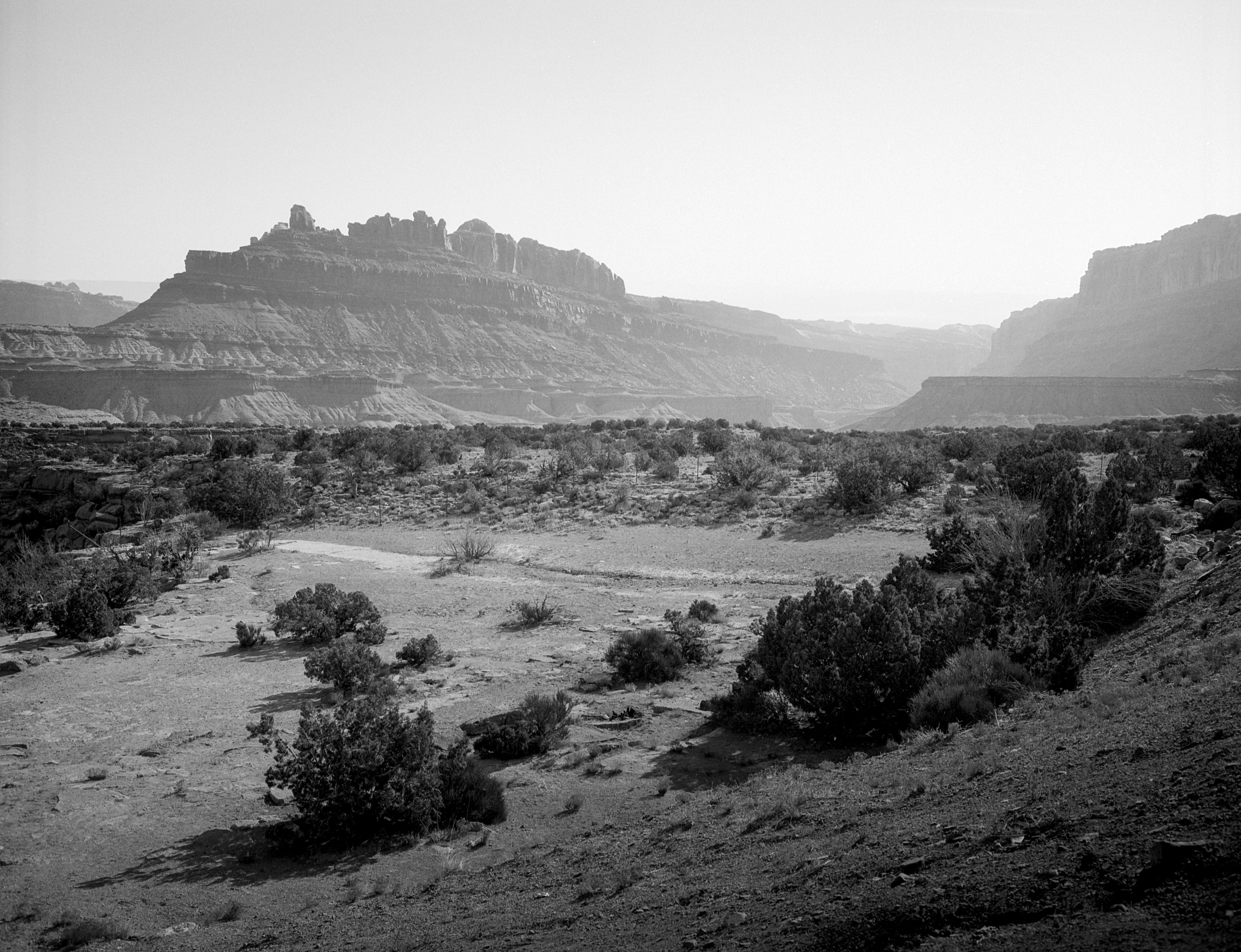
So what does one do in that situation? Could you add a blue or green filter? Maybe. But in most scenes of that type I would imagine that you would just end up with muddy shadows and mid-tones. What you would actually be much better off doing is shooting a film that excels in the exact areas where Acros fails. For me, this film has been somewhat elusive. Not because it’s in any way difficult to find a film that is more sensitive to wavelengths at the short end of the spectrum vs the long end- those were the norm for a very long time and are still available- but because I wanted a film that was more blue sensitive, but which also offered relatively bright skin rendition while maintaining tonal separation against greens. Does it sound like I’m asking for the impossible? Well it turns out that this profile matches up almost perfectly with the spectral sensitivity profile of Kodak Plus-X 125. The problem? Plus-X was discontinued in 2011. So it wasn’t like I could stock up on it the way I had with Acros, which is probably for the best. I discovered that I really liked using it not only in lower contrast, blue hour type situations, but also nearly any time that there was fog or haze in the air. Back when I shot digital, I would have put a polarizer on in hopes of cutting through that haze, and it never would have occurred to me to try to enhance it. But we live and we learn. Sometimes your subject is the terrain of the landscape, sometimes it’s the air itself- a point I tried my very best to relate in my very first post on Substack. Although I have not been able to stock up on Plus-X in the same way as I did with Acros, I have endeavored to buy what I can and I have happily reached a point where I am not in fear of running out any time soon.
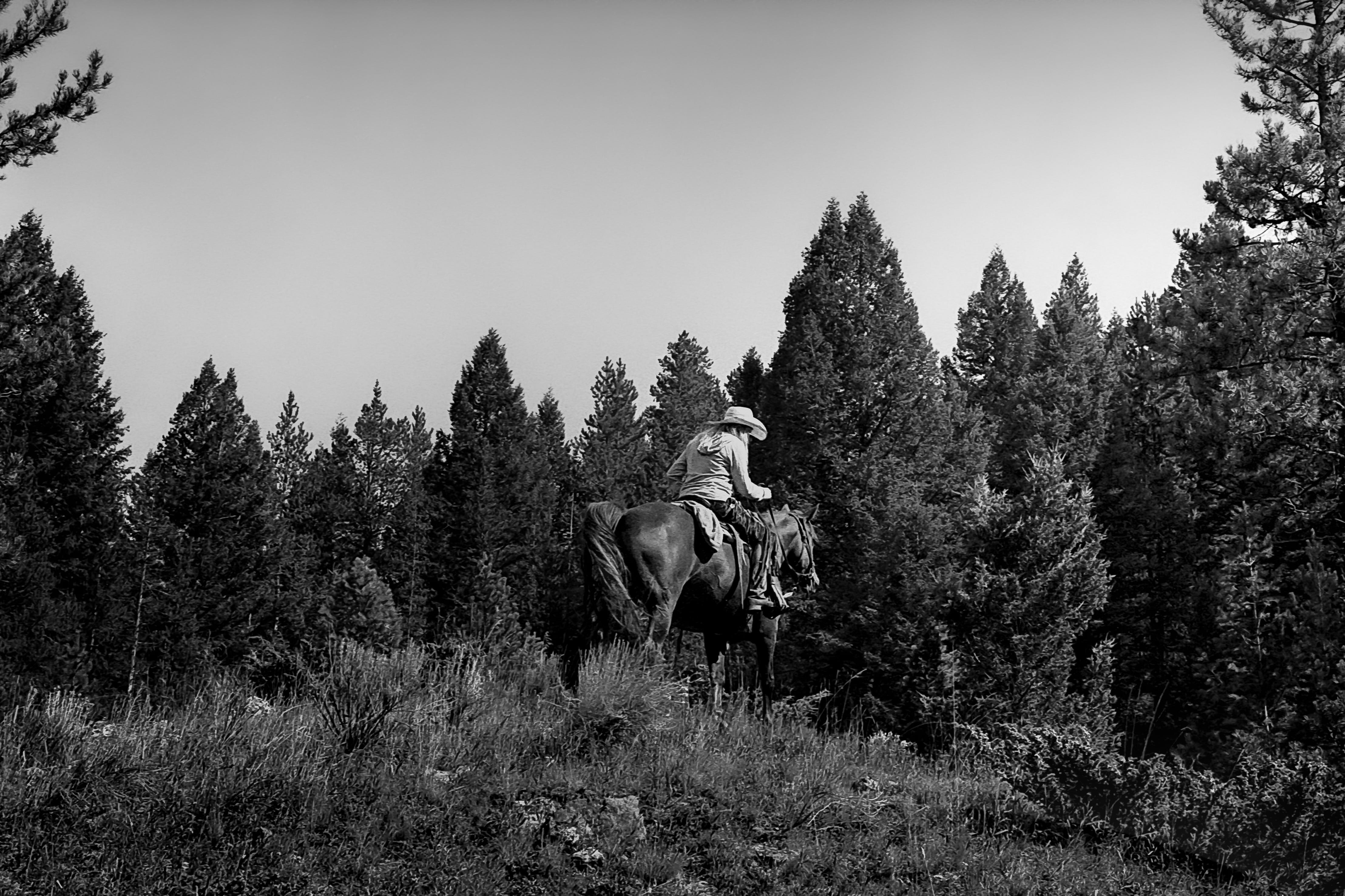
The limited availability of Plus-X, however, has encouraged me to find other solutions when I want that look. Many times, I find myself going for this look while shooting in the desert, where the landscape often extends dozens of miles and the haze in the air has a chance to accumulate along the horizon. Within these scenes, the overall color of the terrain often leans very yellow or orange. In this case, I find that I can get a similar look to Plus-X by shooting Ilford Ortho Plus at an EI of 50. The yellow/orange terrain, which would normally render darker on Ortho film, looks pretty normal at EI 50, but the blue sky/fog/haze registers a bit brighter due to the overexposure. To be fair, I’m sure you could do the same thing with a regular, panchromatic film and a cyan filter. Or, of course, you could just shoot something really flat like HP5 and do it all in Lightroom. It’s probably unreasonable for me to assume that all of you like to do things the hard way too.
As long as we’re talking about workarounds, if you want the dark skies of Acros without the price or the full-roll commitment to that fairly distinctive look, you can shoot something like T-Max 400 or Delta 400 with a deep yellow/orange filter to get similar results on a frame by frame basis, with the added bonus of a bit more speed (depending on exactly what filter you’re using) or you could even shoot something with extended red sensitivity along with a red filter to get a more intense version, such as Ilford SFX 200, Rollei Superpan 200, or Rollei Infrared 400. If you want to go really extreme, I suppose you could just throw an R72 filter on with any of those three, but that’s really a whole different look at that point.
So anyway, this is what I’ve been up to lately- playing around with different stocks and filters in an attempt to replicate the look of other films I really like, while gaining a bit more flexibility from one frame to the next. If I were smart, I would probably find a single 400 speed film with a flat response that I really like, shoot it consistently, and do everything else with filters. In fact, if there’s a recommendation to be made here or an actual point to anything I’m saying in this post, it’s probably that. But as previously discussed, I consider myself a photographic maximalist and choose to reject the premise that the best results come from consistency of process on the basis that it isn’t any fun. That’s the kind of thing I would say at work, and I very much do not do this for work.
Overall, I feel like spectral response is something that most reviews I see of B&W films seem to neglect, with the exception of Greg Davis, of course. A big deal is always made about grain and contrast- both factors that are heavily influenced by exposure and development- but never about the way a film renders colors into gray tones. For me, this is at least as important than those other factors, but seems to get little or no attention unless the review is for a stock which is marketed specifically as an orthochromatic or infrared sensitive film. Personally, I think this leads to a lot of new film shooters shying away from B&W films because when you don’t know how certain wavelengths will render in your image, it becomes impossible to build an accurate mental image of the final frame at the time of shooting. If you are consistently surprised by the results you get, things can get very frustrating very quickly. But instead of delving into this topic, we instead tell them to “pick one film and one lens and get to know it.” That’s some bullshit. That’s basically advising people to lower their expectations to match with the capabilities/characteristics of a single film stock. That’s why we have so many people out here bulk rolling HP5. Pull the tech sheet and look at the spectral chart. Learn how to read it. Shoot one test roll and you’ll have a much better idea of the kind of images you’re likely to get in various situations, as well as how those results can be manipulated with color filters. Better yet, pull several tech sheets before choosing what film to buy in the first place and decide whether or not it is likely to render a scene in a way you like. Before going out to shoot, load a film that will match with your expectations on the day. Have fun with it. And for the record, I have nothing against HP5. It’s what I load when I just don’t know how my day will unfold or where I might be shooting. Well, that’s not entirely accurate. It’s what I keep a roll of in my bag as a sort of “Break Glass In Case of Emergency” film because it has such a wide latitude and relatively flat response. I can shoot it anywhere from 200 to 3200 and get decent results. If I stand develop it, I can shoot anywhere from 200 to 1000 on the same roll without worry. But as a 400 speed “do anything” film, it’s not actually one of my favorites.
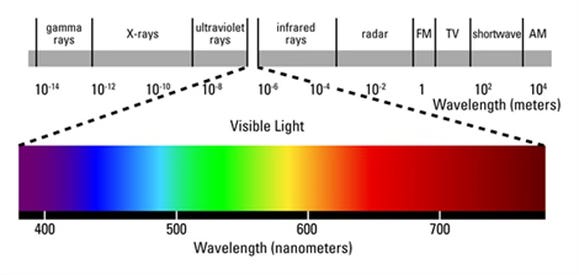
Maybe a thorough examination of 400 ISO B&W films is something that should be saved for another day. For now, I hope that this just makes everyone go and examine some tech sheets and learn a bit more about your favorite films, or use them to find something new to try. I have a feeling that a lot of people skip over these spectrograms because they themselves are in black and white and show color as a wavelength in nanometers along the X axis as opposed to a way that most people can easily comprehend. Below, I’ve added the spectrograms for Acros and Plus X, along with a helpful full-color representation of the visible light spectrum and corresponding wavelengths to make each of them easier to read.
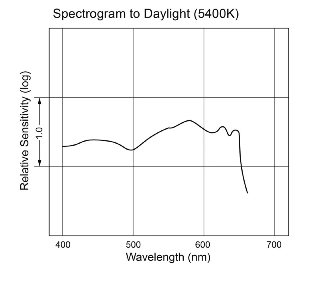
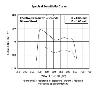
Just be mindful of the fact that Ilford likes to use spectrograms created using Tungsten light, which makes an apples to apples comparison to other manufacturers nearly impossible without just shooting the film to see how it renders. Unless you’re like, super into densitometry and have already gone way farther down this rabbit hole than I have…in which case you probably aren’t still reading this anyway. Just know that you should expect some more blue sensitivity and a bit less in the yellow wavelengths from their films than their spectrograms would indicate if you’re shooting in daylight.
Also, if this is something that you’re also into and have found interesting results with any films I didn’t mention, please let me know. I’m aware of some other films with orthochromatic response, and others with extended red sensitivity. T-Max 100 is certainly similar to Plus-X, but a bit more muted in its short wavelength response. There are other things about T-Max 100, however, that I don’t really care for. So if you have any other good currently available alternatives to Plus-X, I’m all ears!
An interesting read, Dan, thank you.